
Project
Honey Badger
PROJECT
HONEY BADGER
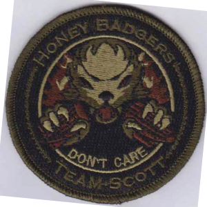
The process of designing this morale patch began with Chief Master Sergeant Madden’s vision to reignite morale for a flight of seasoned Air Force Reserve recruiters attached to the 352nd Recruiting Squadron. Madden was responsible for setting the tone and merging the talents of his airmen to accomplish the mission effectively. In doing so, Madden sought to design the first moral patch for his team of recruiters assigned to Scott Air Force Base, Illinois.

-
To understand the recruiting industry, Master Sergeant West and I had to understand the key visual elements that make a patch design exceptional. As a result, putting ourselves in Madden’s shoes and conducting research helped define the most effective visual elements. The design should focus on building a sense of community, developing a sense of identity, and depicting a state of mind necessary to accomplish the mission at all costs.
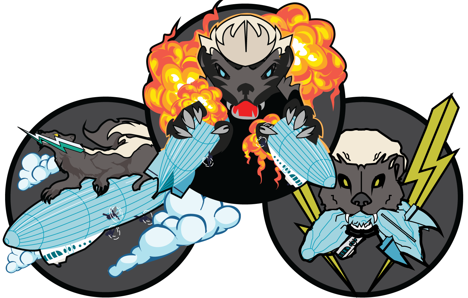
The Honey Badger. What better animal can demonstrate the endless commitment to work consistently for days and nights, with the mind and body unscathed like the honey badger? Born from the midst of brainstorms, West and Madden distinctly had chosen the thick-skinned mammal as the mascot.
Rich History. The zeppelin became a key visual element in the design of the patch. The first zeppelins were flown in 1923 at Scott Air Force Base, further establishing a sense of identity and connection to the community.
Why the explosions? Movement establishes the logical sequence in how recruiters handle information effectively. The recruiting culture and demand to hire and retain talent is a path of competitive advantages and surprises! Explosions can correlate with the blast of applications and requirements to meet goals and initiatives.
-
We now have the wealth of knowledge to organize information effectively, collect inspiration for the patch's colors, and create a consistent theme. After curating a collection of various honey badger poses and zeppelin photographs into a mood board, it was time to combine our research and ideas into four sketches.
-
When sketching ideas, I focus on two primary design elements that fuel the creativity behind original hand drawings and the client's first engagement with the product: proportion and movement.
Proportion. The importance or hierarchy of one visual element from another can add harmony and balance to achieve a good sense of proportion. The honey badger is the more prominent visual element because it represents the Air Force recruiter. The Zeppelin was then scaled down to represent a lesser relationship between the overall message.
The various postures, curved lines, and diagonal lines of the honey badger create a sense of movement. For example, the honey badger tearing the zeppelin apart with its sharp teeth or hitching a ride on the zeppelin towards the final trajectory.
Once the sketches are ready, we share them with the client so they can participate in the first iteration of the logo design process.
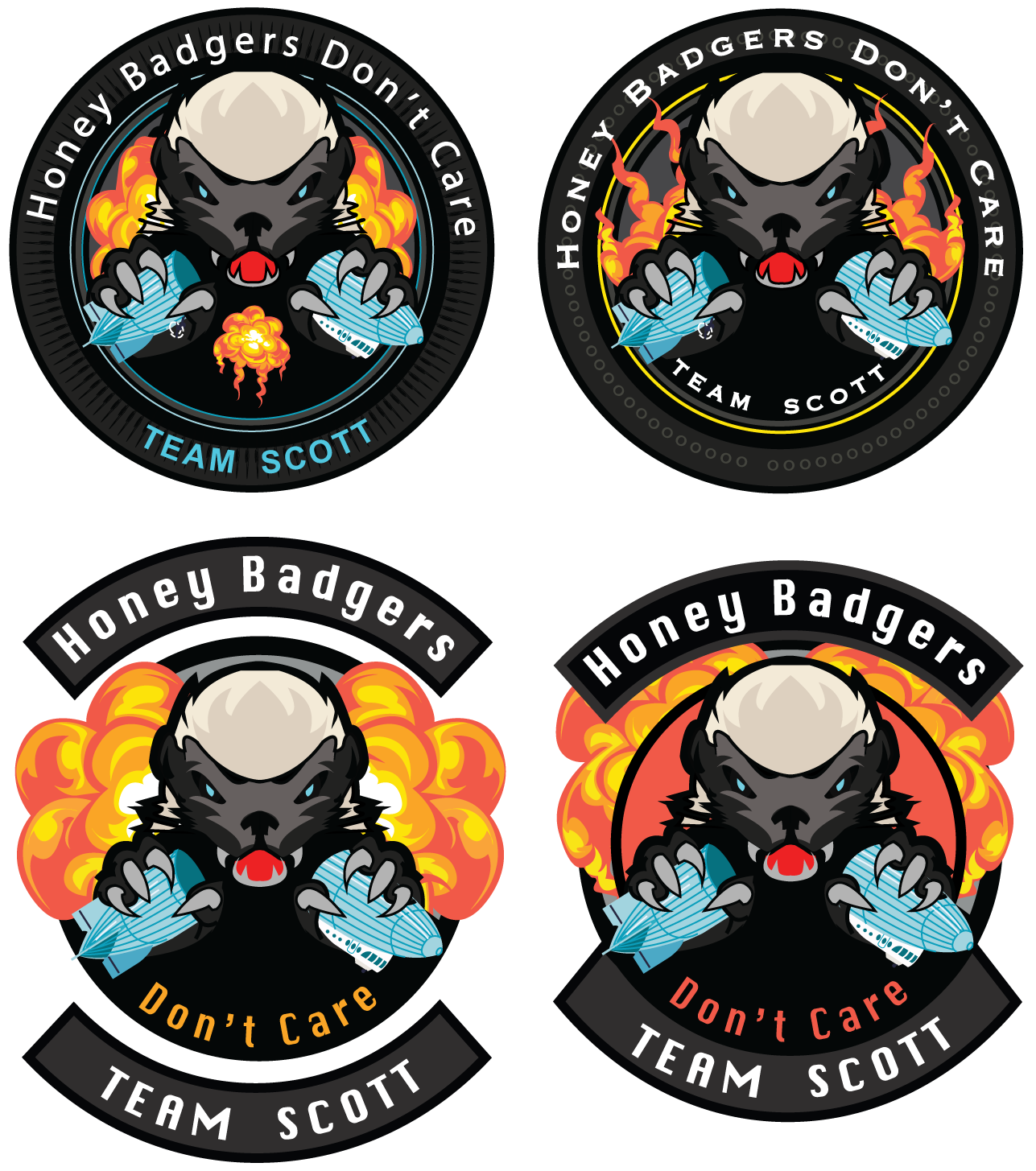
Round 1 - Digitize
At this point, we take the best three sketches and recreate them in Adobe Illustrator. This is the most preferred software because of its simplicity and scalability. During the digitizing phase, I focus on the next two distinct design principles: balance and variety.
Balance. All three sketches are asymmetrical in design. I had to share the same weight across all elements to achieve balance and further convey movement.
Variety. To keep the client engaged with the three designs, I had to add something interesting to the composition to guide their focus and create this intense visual experience. In all three examples, I added visual elements that entice the five human senses, e.g., the compilation of explosions associated with sounds, the propeller shifting through the clouds, and the sounds of a deflating zeppelin.
With that, we will send the client the first digitized version (with color) for feedback and selection.

Round 2 : Refine
Only one design will proceed to the next round of fine-tuning after carefully considering the overall message and tone. We encourage our clients to share the first version of designs with their counterparts to identify areas for enhancements. In the first round of refinement, I pay close attention to the next design principles of contrast and emphasis.
Emphasis and Contrast. The bold lines outlining the honey badger create this positive/negative relationship with the background and subject. I used the shape of the explosions to further immerse the viewer in what is happening behind the scenes. I used a triadic color scheme of red, yellow, and blue to create a sense of urgency and attention. The color scheme creates a visual appeal and emotional impact because of the various levels of energy represented in each color. And lastly, I added spacing around certain objects to distinguish specific elements. Ultimately, by using colors, sizing objects, and using unique shapes created contrast.
Round 3 - Finalize
In the third round of revisions, we guide the client to focus on minor elements of the overall design, like the font type, text placement, and the border that holds the entire composition. The following two principles to focus on are repetition and patterns.
Repetition and Pattern. Repeated elements on the composition's border are pleasing and ensure consistency with the overall design. On the patch, repetition is given to the repeated circle pattern found within the circle's border.
Project Delivery
It’s time to deliver the final design.
We provided Madden various print and digital file formats, including color and black/white variations. We also tailored the final design to follow the approved Air Force uniform color palette established by the Institute of Heraldry for patch manufacturing and print.
And with that, we focus on the last design elements: Harmony and Unity. The three elements—the honey badger, zeppelin, and explosions—should be cohesive. To achieve this final sense of harmony, we incorporated specific design principles through each iteration of the design process. We also achieved unity by clearly relating the three visual elements.
Conclusion
Ultimately, it’s all about involving the client in the logo design experience. By involving them through each iteration of the design process, the client becomes emotionally immersed from start to finish. As a result, we do not skip any of the steps in this process, as both parties will greatly benefit from the imagination and process to create an everlasting morale patch for years to come.